


Our studio was asked to redefine the visual identity for Denova, an architectural design company. The task involved a new interpretation of the company’s existing logo (the project did not involve designing a logo) as well as designing and developing a new website.
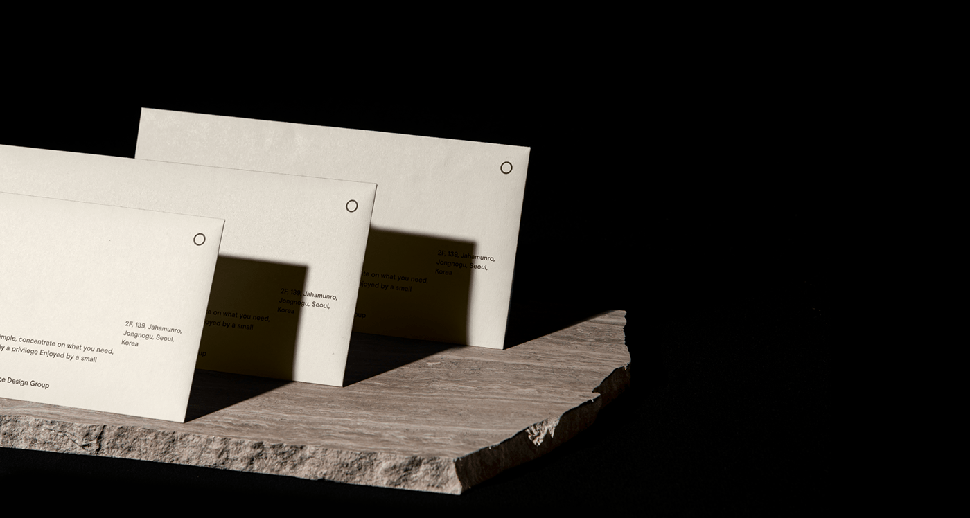
We took the cue from Denova’s philosophy, which is to ‘focus on the necessities, be true to the foundations, and work with an upright mind.’ We summed this up in a phrase ‘to lead in the right direction’ and connected this to the ‘navigation dot’ in the logo. We paid particular attention to the layout. The quadrant layout and the navigation dot which is always positioned in the upper-right corner, were created to represent Denova’s value of working towards the right direction.
건축 디자인 사무소 Denova의 아이덴티티(로고 디자인 제외)를 재정립하고 웹 사이트 디자인과 개발을
진행했습니다. 필요한 부분에 집중하고 기본에 충실하며, 올바른 생각으로 프로젝트에 임하는 Denova의
철학과 로고의 닷(Dot)에서 영감을 받아, “올바른 방향으로 이끄는 디노바”라는 브랜드 아이덴티티를
설정했습니다. 사분면 레이아웃과 레이아웃 안에서 항상 우상향에 위치하는 내비게이션 닷(Navigation
dot)은 더 나은 방향을 제시하는 디노바의 브랜드 가치를 내포합니다.

Task & Project Goal
매뉴얼 그래픽스는 Denova 기존 로고의 닷(Dot)에서 영감을 받아 디노바의 브랜드 아이덴티티을 확장하고 웹사이트
디자인을 진행했습니다.

Graphic keyword
그래픽 키워드 Basic, Essential, Typography는 디노바가 주요 가치로 여기는 '기본’에서 추출되었습니다. 각 키워드는 단어의 본질을 공유하며 순환합니다.


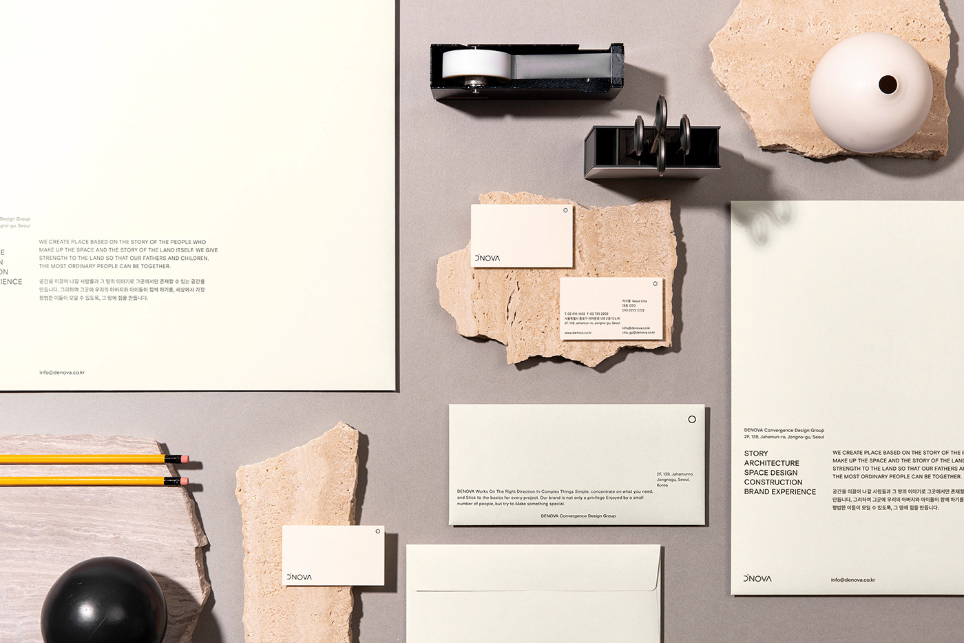
Basic Layout
좌측 하단에서 우상향하는 콘텐츠와 우측 상단에 위치하는 닷(Dot)을 디노바의 기본 레이아웃으로 설정했습니다.
Typeface
디노바의 타이포그래피는 기존 로고타입의 둥글고 안정적인 느낌과 잘 어우러지는 Basis Grotesque Pro medium를
사용합니다. 비교적 자간을 넓게 사용하여 대지 위 공간감각을 다루는 디노바의 인상을 전달할 수 있도록 합니다.

Color
디노바는 따뜻한 톤의 Denova Ivory, Denova Grey를 키컬러로 사용해, 모노톤 위주의 차분한 이미지를 전달합니다.


ㅤㅤㅤ
Year. 2022
Work Scope. Web Design, Development, Identity design
Client. Denova
Directer. MG.LeeSeongkyun
Designer. MG.KimGyuri
Photographer. MG.LeeHanyeon
Motion. MG.KimYeonkyung


